Overview
About Data
Pre-Process
#calling packages
library(dplyr)
library(ggplot2)
library(plotly)

#read data
id_pop <- read.table("id_pop_proj.csv", as.is = TRUE, header = TRUE)
id_pop <- as.tbl(id_pop)
id_pop
# A tibble: 992 x 4
    year sex   age   population
   <int> <chr> <chr>      <dbl>
 1  2015 male  0-4       11242.
 2  2015 male  5-9       11303.
 3  2015 male  10-14     11242.
 4  2015 male  15-19     11188.
 5  2015 male  20-24     11101.
 6  2015 male  25-29     10900
 7  2015 male  30-34     10593.
 8  2015 male  35-39      9955.
 9  2015 male  40-44      9304.
10  2015 male  45-49      8200.
# ... with 982 more rows
#Changing data structure
yr <- unique(id_pop$year)
sexf <- unique(id_pop$sex)
agef <- unique(id_pop$age)
id_pop <- id_pop %>%
  mutate(age = factor(age, levels = agef)) %>%
  mutate(sex = factor(sex, levels = sexf))
id_pop
# A tibble: 992 x 4
    year sex   age   population
   <int> <fct> <fct>      <dbl>
 1  2015 male  0-4       11242.
 2  2015 male  5-9       11303.
 3  2015 male  10-14     11242.
 4  2015 male  15-19     11188.
 5  2015 male  20-24     11101.
 6  2015 male  25-29     10900
 7  2015 male  30-34     10593.
 8  2015 male  35-39      9955.
 9  2015 male  40-44      9304.
10  2015 male  45-49      8200.
# ... with 982 more rows
Visualize Population Structure
#transform negative sign for male
id_pop <- id_pop %>%
  mutate(population_sign = ifelse(sex == "male", -population, population))
#ggplot2
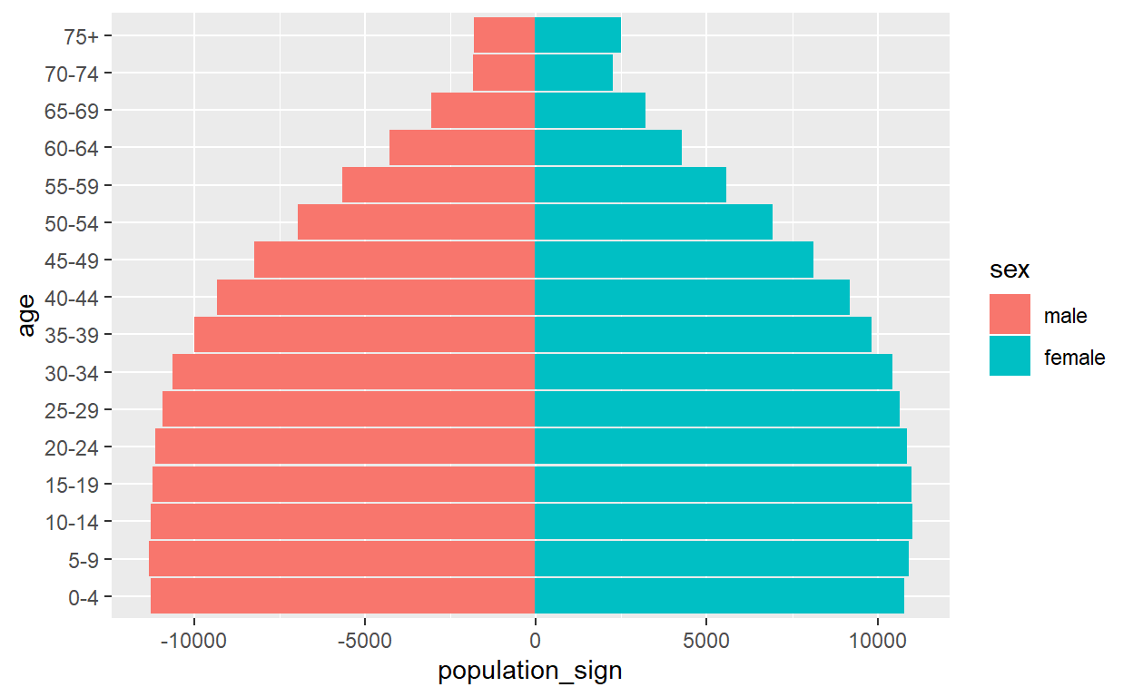
#/single or specific year
#//2015
id_pop %>%
filter(year == 2015) %>%
ggplot(aes(age, population_sign, color = sex)) +
geom_bar(aes(fill = sex), stat = "identity") +
coord_flip()
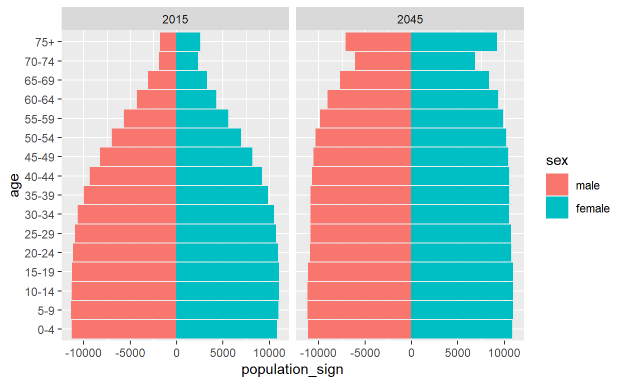
#/multiple-two years
#//begining and ending projection period (2015 vs 2016)
id_pop %>%
  filter(year %in% c(2015, 2045)) %>%
  ggplot(aes(age, population_sign, color = sex)) +
  geom_bar(aes(fill = sex), stat = "identity") +
  coord_flip() +
  facet_grid(~year)
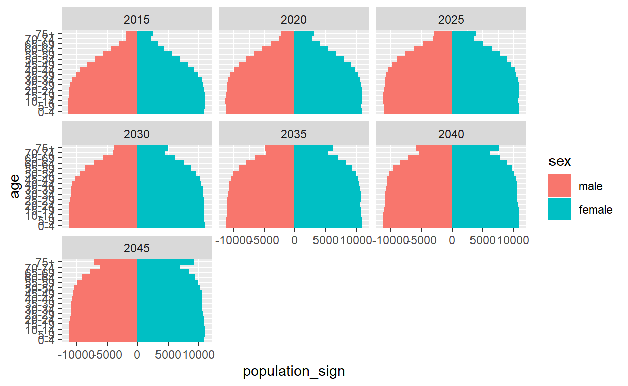
#/multiple-5 yeras increment
id_pop %>%
  filter(year %% 5 == 0) %>%
  ggplot(aes(age, population_sign, color = sex)) +
  geom_bar(aes(fill = sex), stat = "identity") +
  coord_flip() +
  facet_wrap(~year)
# #plotly
# id_pop %>%
#   plot_ly(x = ~population_sign, y = ~age, color = ~sex, frame = ~year, type = "bar") %>%
#   layout(xaxis = list(title = "Population (x1000)"),
#          yaxis = list(title = "Age"),
#          bargap = 0.1, barmode = "overlay") %>%
#   animation_slider(
#     currentvalue = list(prefix = "Year ", font = list(color="red"))
#   ) %>%
#   animation_opts(frame = 2000)
Structure Change Analysis
Dependency Ratio
#calcaulting dependency ratio
id_dep <- id_pop %>%
  group_by(year, age) %>%
  summarise(population = sum(population))
id_dep$sex <- "all"
id_dep_sex <- id_pop %>%
  group_by(year, sex, age) %>%
  summarise(population = sum(population))
id_dep <- full_join(id_dep_sex, id_dep)

sex <- dr <- c()
for(year_i in yr){
  for(sex_i in c("male", "female", "all")){
    tmp <- filter(id_dep, year == year_i & sex == sex_i)
    sex <- c(sex, sex_i)
    dr <-  c(dr, as.numeric(sum(tmp[c(1,3),4])/tmp[2,4]*100))
  }
}
dep_rat <- data.frame(year = sort(rep(yr,3)), sex = sex, dr = dr)

#plot
dr_trend <- ggplot(dep_rat, aes(year, dr))+
  geom_line(aes(color = sex))+geom_point(aes(color = sex))+
  labs(title = "Dependency Ratio Trend", x = "Year", y = "Dependency Ratio (%)")+
  scale_x_continuous(breaks = seq(2015, 20145, by = 5), labels = seq(2015, 20145, by = 5))+
  theme_minimal()
ggplotly(dr_trend)
Citation
For attribution, please cite this work as
Prasojo (2019, Oct. 19). My Pages as R User: Using dplyr ggplot2 & plotly for Simple Analysis of Population Structure. Retrieved from https://aripusrwantosp.github.io/posts/2019-10-19-using-dplyr-ggplot2-plotly-for-simple-analysis-of-population-structure/
BibTeX citation
@misc{prasojo2019using,
  author = {Prasojo, Ari Purwanto Sarwo},
  title = {My Pages as R User: Using dplyr ggplot2 & plotly for Simple Analysis of Population Structure},
  url = {https://aripusrwantosp.github.io/posts/2019-10-19-using-dplyr-ggplot2-plotly-for-simple-analysis-of-population-structure/},
  year = {2019}
}